An app for managing all your subscriptions in one place.

Product
Mobile App
Original Concept
Role
UX/UI Designer, User Researcher
Tools
Figma, Canva, Discord
SubTracked is an app that helps you manage and cancel all your subscriptions in one place, ensuring you stay organized and in control of your spending.
Overview
The goal was to create an app that allows users to manage and cancel their subscriptions with ease, eliminating the hassle of manual tracking or overlooked charges. Managing multiple subscriptions can be overwhelming, so I wanted to provide a platform that helps users stay organized and in control of their spending.

THE PROBLEM
Managing subscriptions across various platforms is often cumbersome and confusing for users, leading to missed charges, unexpected renewals, and wasted money. Users need a simple, centralized way to track, manage, and cancel their subscriptions without having to navigate multiple platforms or keep manual reminders.
THE SOLUTION
I created an app that simplifies subscription management by providing users with an easy-to-read dashboard of their active subscriptions, charges, and usage. It allows users to track their spending, view upcoming charges, and cancel subscriptions with just a few clicks. The app’s user-friendly interface ensures managing and canceling subscriptions is a smooth, intuitive process.
The Design Process
When developing Subracked, I applied design thinking to ensure a user-centered approach throughout the entire design process. Design thinking focuses on understanding user needs, defining clear problems, ideating creative solutions, prototyping those ideas, and then testing them with real users. By following this iterative, solution-focused methodology, I was able to empathize with users, experiment with new ideas, and refine the design based on feedback. This process allowed me to explore multiple design solutions, ensuring that the final product not only meets user expectations but also offers a seamless and efficient subscription management experience.

Who are We Designing For?
To begin, I needed to put myself into the shoes of the user. I began researching to better understand the challenges and needs of users managing their subscriptions. Through this process, I sought to identify key pain points and uncover opportunities to improve the overall experience. My research was guided by the following questions:
1. What challenges do users face in tracking all their subscriptions?
2. How do users feel about the process of unsubscribing from unwanted services?
3. What factors influence whether a user allows auto-renewal for their subscriptions?
4. How do users currently track and manage their subscriptions, and what tools do they prefer?
5. What are the common behaviors and strategies users employ to manage their subscriptions without a dedicated mobile app?
These questions were instrumental in gaining insight into user behaviors and guiding the development of a user-friendly and effective solution.
Secondary Research
My "Discovery" phase started with secondary research online to explore existing information about users’ challenges with managing subscriptions. It became clear that users struggle to remember all the services they’ve subscribed to, with many continuing to pay for services they no longer use.
Additionally, the process of unsubscribing is often intentionally complicated by design, making it difficult for users to cancel services. Several apps have emerged to help users track and manage subscriptions, but they come with their own pros and cons. Secondary research didn’t fully address key aspects of user feedback. This gap led me to dive into primary research to gain deeper insights into user pain points.
Primary Research


"Canceling can sometimes be a challenge, had to literally search on Google how to cancel something."
" A couple of times I got charged for things I didn't use...I felt upset with myself..."
Now, let's hear from individual users. To begin, I identified the target audience to guide the selection of interview participants. Since subscriptions are widespread, I ensured the criteria were broad enough to include a wide range of users. However, I focused specifically on those who struggle with managing subscriptions, as they are more likely to be budget-conscious and less tech-savvy.
The users had to:
1. be over 30 years of age
2. be middle class, budget-conscious
3. have at least 3 subscriptions
4. own a smartphone
Once I gathered my top five users, I conducted semi-structured interviews via Zoom to better understand how they manage their subscriptions and the challenges they face. I wanted to uncover their methods for tracking services, handling auto-renewals, and how they feel about existing tools in the market. The insights largely confirmed my hypothesis: users struggle to keep track of multiple subscriptions, often leading to forgotten charges and a sense of frustration, especially with annual fees and cancellation processes. You can see the common themes and key takeaways on the left.
Defining The User
With a clearer understanding of my users, I moved into the defining phase. I developed user personas based on the shared needs, desires, and recurring pain points identified during my interviews.


Alleviating the Pain Points
To address these pain points and transform the potential advantages into reality, I created five "How Might We" statements to clarify my goals before beginning the design process.
How might we simplify the process of managing multiple subscriptions?
How might we reduce the time it takes for users to track and cancel unwanted subscriptions?
How might we make subscription management feel less overwhelming?
How might we help users avoid unexpected charges from subscription renewals?
How might we ensure users feel secure and confident inputting their financial information?
Competitive Analysis
Industry Leaders
After researching competitors, I found that while the market for subscription management tools is growing, many solutions focus more on financial tracking rather than offering an intuitive, all-in-one mobile experience for managing subscriptions.
To better understand the landscape, I conducted a usability analysis, focusing on how these apps help users track and manage their subscriptions. This allowed me to pinpoint the strengths and areas of improvement within competing apps.
My analysis focused on how these apps managed a user-friendly design, customization and organization, visual insights and analytics, and navigation and context.


Rocket Money
Rocket Money is an app designed to help users track and manage their recurring payments, offering insights into spending patterns and potential savings.
Provides detailed insights, including cost breakdowns, renewal dates, and visual analytics through calendars and graphs
Unsubscribing from services is straightforward, making it easy for users to manage recurring payments.
The interface may overwhelm new users with too much information at first glance, requiring a learning curve.
Hiatus
Hiatus is an app that helps users manage and reduce their bills by offering personalized financial insights and assistance in canceling unnecessary services.
Canceling a subscription is simple, with prominent visuals guiding the user through the process.
The app's interface can feel unintuitive, lacking a clear, dedicated subscription section for the user.
Minimal use of icons and branding diminishes engagement, especially for identifying subscription services.
Bobby
Bobby is a minimalist app designed to help users track their subscriptions by offering a customizable, user-driven approach to managing their expenses.
Allows users significant freedom to organize subscriptions and adjust relevant details, like billing cycles.
Clean, minimalistic and modern design with an intuitive, user-friendly flow that is easy to follow.
Lack of auto-syncing with bank accounts or services like Apple ID requires full manual input, which may lead to user error.
Early Ideation
User Flow
After analyzing where current competitors were falling short in subscription management, I began outlining the key task flows for SubTracked. I developed user stories based on critical user actions and narrowed them down to focus on the most essential features that would provide the most value quickly. This process resulted in three primary user flows:
1. The user wants to view a snapshot of all their subscriptions.
2. The user wants to unsubscribe from a subscription.
3. The user wants to view this month's subscriptions on a calendar.
These flows guided the app's design to ensure users could easily accomplish their core goals.
_edited.jpg)
Sketching it Out
At this stage, I began creating the initial sketches for SubTracked, using the research I had gathered and the user flows I had established. My goal was to keep the interface clean and minimal, ensuring users could quickly navigate and manage their subscriptions without feeling overwhelmed.
I initially sketched out a few screens, focusing on simplicity, but as I progressed and transitioned into the wireframing and prototyping stage, I realized additional screens and flows were necessary to enhance the overall user experience, so I added a couple more to accommodate those needs later in my design process.


Clean Dashboard
Intuitive Home Page

Detailed breakdown of subscription
Initial Guerilla Usability Testing
To gather early and ongoing feedback for SubTracked, I conducted guerilla usability testing, following Lean UX methodology. My main objective was to ensure that both the overall flow and individual screens made sense and to determine if any additional screens were needed for users to complete tasks effectively. I provided users with the following tasks and gathered insights on their experience:
1. View a snapshot of your subscriptions.
Home page with the main subscription overview page felt intuitive.
Clean layout and ability to quickly see all their active subscriptions.
User questioned the use of the "Search" function, claiming it was unnecessary.
2. Cancel a subscription.
Unsubscribe process was clear for most users.
Unsubscribe button was easy to locate.
Users noted that there could be clearer confirmation once a subscription was successfully canceled.
3. View your subscriptions on a calendar.
Users located the calendar view quickly.
Appreciated the clear display of upcoming charges.
User questioned the use of color-coding on the calendar, did not feel intuitive.
Piecing It Together
Wireframes
After completing my rough sketches, I advanced to creating detailed wireframes to better define the app’s layout and overall structure. The purpose of these wireframes was to provide a tangible framework that clarified how users would navigate SubTracked. It also allowed me to identify potential pain points and gather user feedback early in the process, ensuring the design aligned with the users’ needs before moving into high-fidelity designs.
Flow 1: User wants to view a snapshot of all their subscriptions.

Flow 2: User wants to view this month’s subscriptions on a calendar.
Flow 3: User wants to unsubscribe from a subscription.

Key Challenges
A significant challenge I encountered during the design process was ensuring the app's flow and functionality felt truly streamlined. While I aimed for simplicity in the wireframes, it became evident that the user experience required more depth to accommodate critical features. Specifically, I had to create additional screens and flows: one for user sign-up, essential for inputting banking information, and another for accessing detailed reports of subscriptions, which aligned with users' needs for understanding their costs better.
This experience highlighted the importance of balancing simplicity with functionality, ensuring that while the interface remained user-friendly, it also effectively addressed the diverse requirements of the app's users. Ultimately, refining these elements enhanced the overall usability of SubTracked and better served its purpose.
Testing the Design
I carried out an additional round of usability testing to confirm that my design choices were aligned with user needs, and to identify any areas that might require adjustment for my final iterations. The insights gathered during this process included:
Positive Feedback:
-
Users easily navigated the app, finding the snapshots on the home screen to provide a helpful overview of their subscriptions without any confusion.
-
Participants appreciated the intuitive layout and clear presentation of subscription charges, allowing them to interact with the app effectively.
-
The visual aids, such as histograms, helped users quickly assess their spending habits, facilitating smoother interactions.
Negative Feedback:
-
Multiple users struggled with the colored dots on the calendar, leading to confusion about what each dot represented, which hindered their ability to use that feature effectively.
-
The search bar's purpose was unclear during interactions, causing users to hesitate and ultimately disregard it as unnecessary.
-
Several participants found the cancellation steps to be overly negative, which affected; they suggested that the tone could be more encouraging to enhance the user experience.
High Fidelity
Reshaping the Design
As I developed my high-fidelity designs, I made several iterations that significantly altered the app's look and feel. I focused on enhancing the user experience by adding new features and contextual elements for better clarity. These refinements were largely driven by ongoing usability testing and user feedback.
Usability Testing Round #1
From my first round of usability testing for my high-fidelity screens, I made the biggest jump in changes to the screens from user feedback.
Positive Feedback:
-
Straightforward navigation.
-
Information displayed.
-
Design felt intentional and intuitive, making errors minimal.
Negative Feedback:
-
Screens did not mesh well.
-
Activity level chart did not feel intuitive.
-
Look and feel felt stark.
Implementation: graph fixes, upgraded look and feel, layout fixes


Usability Testing Round #2
For my second round of usability testing, I aimed to confirm the effectiveness of the new changes and identify any emerging patterns in usability issues.
Positive Feedback:
-
Cancellation flow.
-
Contextual elements.
-
Graphs displayed in Reports.
-
Overall felt clean and intuitive.
Negative Feedback:
-
Negative signs with charges were inconsistent.
-
Calendar needed to be more attractive.
-
Colors on graphs weren't intuitive.
Implementation: calendar changes, graph color fixes, consistency
Final User Interface
The final designs prioritize the user experience, seamlessly blending essential subscription management features with an intuitive and enjoyable interface.
Sign Up Flow
Unsubscribe from a subscription.
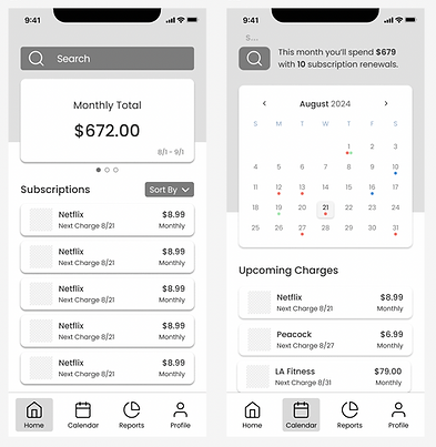
View this month's charges on a calendar.


View your subscriptions' reports.


Style Guide
The choice of colors, typography, icons, and UI elements conveys a clean, friendly, and trustworthy style, creating a welcoming and approachable user experience.
Primary
#4A90E2
Secondary
#A2E8AF
Accent
#FF6F61
Neutral
#333333
#F3F7FD
#2568B7
#FBFBFB
#F8F8F8
#7B7B7B


Final Prototype

Thank you.